User Guides
Font Size and Style
Learn how to customize your resume’s font style and size in Rezi, plus expert tips for choosing readable, professional fonts that impress recruiters.
Published on
July 20, 2026
Updated on
July 20, 2026
Your resume’s font might seem like a small detail, but it forms that first impression before recruiters read a single bullet point. A font that’s difficult to read, outdated, or poorly sized can make even a strong resume feel like amateur hour. The right combination of font style and size keeps the focus where it belongs: on your skills and experience.
In this guide, I’ll show you how to change your font with Rezi and choose the right size.
Before you focus on fonts, create your application with our free AI Resume Builder. We guide you with ATS-friendly tips and tailored feedback to help you get noticed.
You can also try our advanced tools and features:
And check out more resume formatting advice:
Changing Your Font Size and Style
Rezi lets you change your resume font style and size from the Finish Up & Preview tab. You can experiment with different combinations to see what fits your resume while sticking with ATS-friendly formatting.
So, what font makes the best fit?
If you’re trying to fit more details onto one page or you have extra white space to fill, tweaking the font size can help refine your layout without sacrificing readability. Just remember: your font should be easy to scan, not force recruiters to squint or sift through a crowded page.
How to Change the Font
Here’s a breakdown of how to customize your font with Rezi:
- Head to the Finish Up & Preview tab to review your resume and access all of Rezi’s formatting options, where you can make final adjustments.
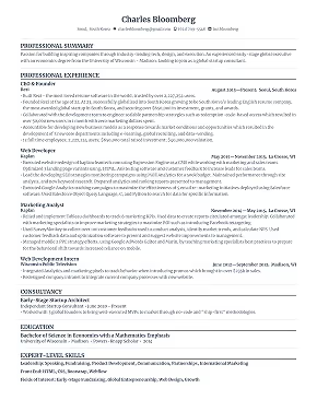
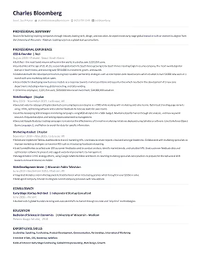
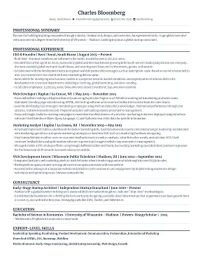
- Explore the font options, with professional choices like Merriweather, Source Sans Pro, Calibri, Times New Roman, and Courier New.
- Adjust the font size to improve readability and optimize your resume layout, aiming for 9–12 points.
- Add a pop of color to your name and section headings for a subtle touch of personality; just keep the main body text black and use color sparingly.
Let’s get into the details.
1. Head to the Finish Up & Preview tab
As you build your resume, Rezi walks you through each section step by step. Along the way, you’ll see guided input fields, expert writing tips, AI bullet points, and personalised feedback to help you make the best of each section.

Once you’ve finished filling everything out, open the Finish Up & Preview tab. This last stop is your final review before sending applications, so take some time to spot any mistakes, improve your content with our AI Keyword Targeting tool, and ensure your resume looks professional.
2. Explore the font options
At the top of the Finish Up & Preview page, you’ll find several ATS-friendly formatting controls, including options for line spacing, resume icons, and fonts.
Rezi currently lets you choose from these fonts:
- Merriweather
- Source Sans Pro
- Calibri
- Times New Roman
- Comic Sans
- Courier New
- Roboto Mono

Not sure which one to choose? If you’re applying for professional roles, I’d stick with Merriweather, Source Sans Pro, Calibri, Times New Roman, or Courier New. These fonts are familiar, easy to read, and recruiter-friendly.
Ultimately, your font should support your content, not compete with it. A simple, readable typeface helps hiring managers scan your resume without distracting from your qualifications.
3. Adjust the font size
You can also change your font size in the Finish Up & Preview tab. Rezi supports sizes from 6 to 16 points, but most resumes look best somewhere in the middle.
A font size between 9 and 12 points usually has the right balance. It’s large enough to read comfortably while leaving enough room to fit your experience on one page.
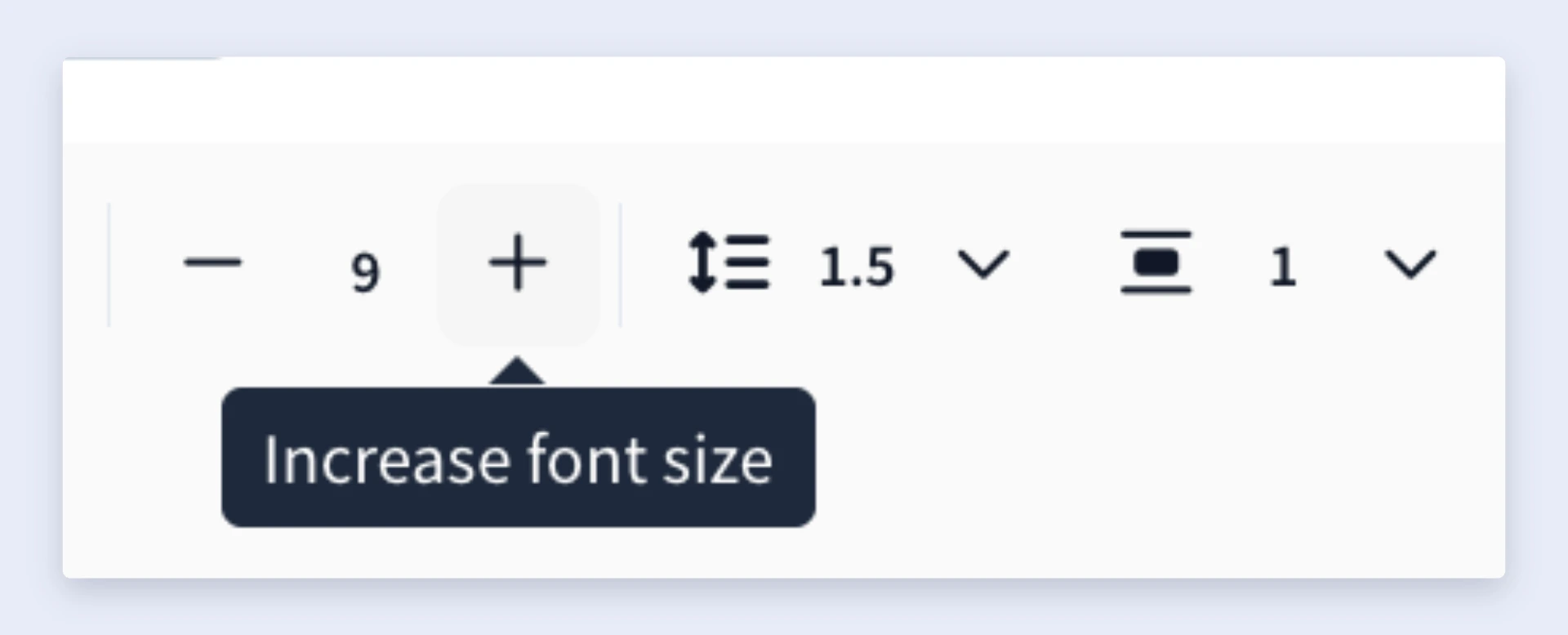
That said, there’s no universal “perfect” size. Thinner or narrower fonts often look better at a slightly larger size, while wider or heavier fonts can remain readable at a slightly smaller size.
You can also adjust the size based on your layout:
- Increase the font size if your resume has too much empty space.
- Decrease it slightly if you need to fit more content on one page.
- Avoid the smallest and largest settings, since both can make your resume harder to read.
4. Add a pop of color
Want to give your resume a little more character? Rezi also lets you customize the colors for your name and section headings. This works especially well in creative industries, where a touch of aesthetics can help your resume stand out and reveal hints of your personality.

You can choose a professional-looking accent for your headings, but don’t overdo it. The goal is to guide the reader’s eye through your resume, not distract them from the experience and skills that matter most.
And keep the main body text black. Rezi intentionally limits the body text to black shades because they offer the best readability and keep that professional appearance.
Summary
Here’s everything you need to know about changing your font with Rezi:
- Choose your font and font size from the Finish Up & Preview tab after you’ve finished building your resume.
- Rezi offers several ATS-friendly fonts, including Merriweather, Source Sans Pro, Calibri, Times New Roman, Courier New, Roboto Mono, and Comic Sans.
- For most resumes, Merriweather, Source Sans Pro, Calibri, Times New Roman, or Courier New are the safest choices because they’re readable and recruiter-friendly.
- Aim for a font size between 9 and 12 points. Rezi supports sizes from 6 to 16 points, but extreme sizes can make your resume difficult to read.
- Adjust your font size based on your layout; slightly increase it if your resume has too much white space, or decrease it if you need to fit more content on one page.
- The best font is one that improves readability without drawing attention to itself. Your content should stand out, not the typography.
- Keep your formatting consistent throughout your resume. Using one font, one body text size, and a clear hierarchy for headings creates a professional document that’s easy for both recruiters and applicant tracking systems to scan.
FAQ
Where can you change your resume’s font style?
You can change your resume’s font style in the Finish Up & Preview tab once you’ve finished building your resume. At the top of the page, you’ll find Rezi’s formatting controls, where you can switch between different ATS-friendly fonts, adjust the font size, change line spacing, and customize a few other design elements before downloading your resume.
What are the best fonts to use on your resume?
The best resume fonts ensure your resume is easy to read. In most cases, Merriweather, Source Sans Pro, Calibri, and Courier New are smart choices because they’re professional, familiar, and ATS-friendly.
Your font shouldn’t distract recruiters from your experience. Instead, it should help them scan your resume quickly and comfortably. If you’re ever unsure, stick with a simple font over something decorative or overly stylized.
Can you use different fonts on your resume?
With Rezi, your resume uses one font throughout to keep the formatting organized and consistent. However, you can still create visual hierarchy by bolding or italicizing specific text. Simply highlight the text you want to format and choose the appropriate styling option.
Using one font also gives your resume a cleaner and more professional appearance. Mixing multiple fonts can make your resume look busy and distract from your qualifications.
Can you customize your resume’s formatting in Rezi besides the font?
Yes, Rezi lets you customize several formatting options in the Finish Up & Preview tab. Along with changing the font style and size, you can adjust line spacing, choose whether to display icons, and customize the colors used for your name and section headings.
Can you change the color of your resume text in Rezi?
Yes, but only to a certain extent. Rezi lets you customize the color of your name and section headings, making it easy to add a subtle touch of personality to your resume.
The main body text, however, stays black. That’s intentional; black text offers the best readability for recruiters and applicant tracking systems. If you decide to add color, use it sparingly. A simple accent for your headings can make your resume more visually appealing without taking attention away from your qualifications.

Lauren Bedford is a seasoned writer with a track record of helping thousands of readers find practical solutions over the past five years. She's tackled a range of topics, always striving to simplify complex jargon. At Rezi, Lauren crafts genuine and actionable content that guides readers in creating standout resumes to land their dream jobs.