
Discover the 2025 resume trends, learn how design has evolved, and get practical tips to create a clean, professional resume that actually gets read.

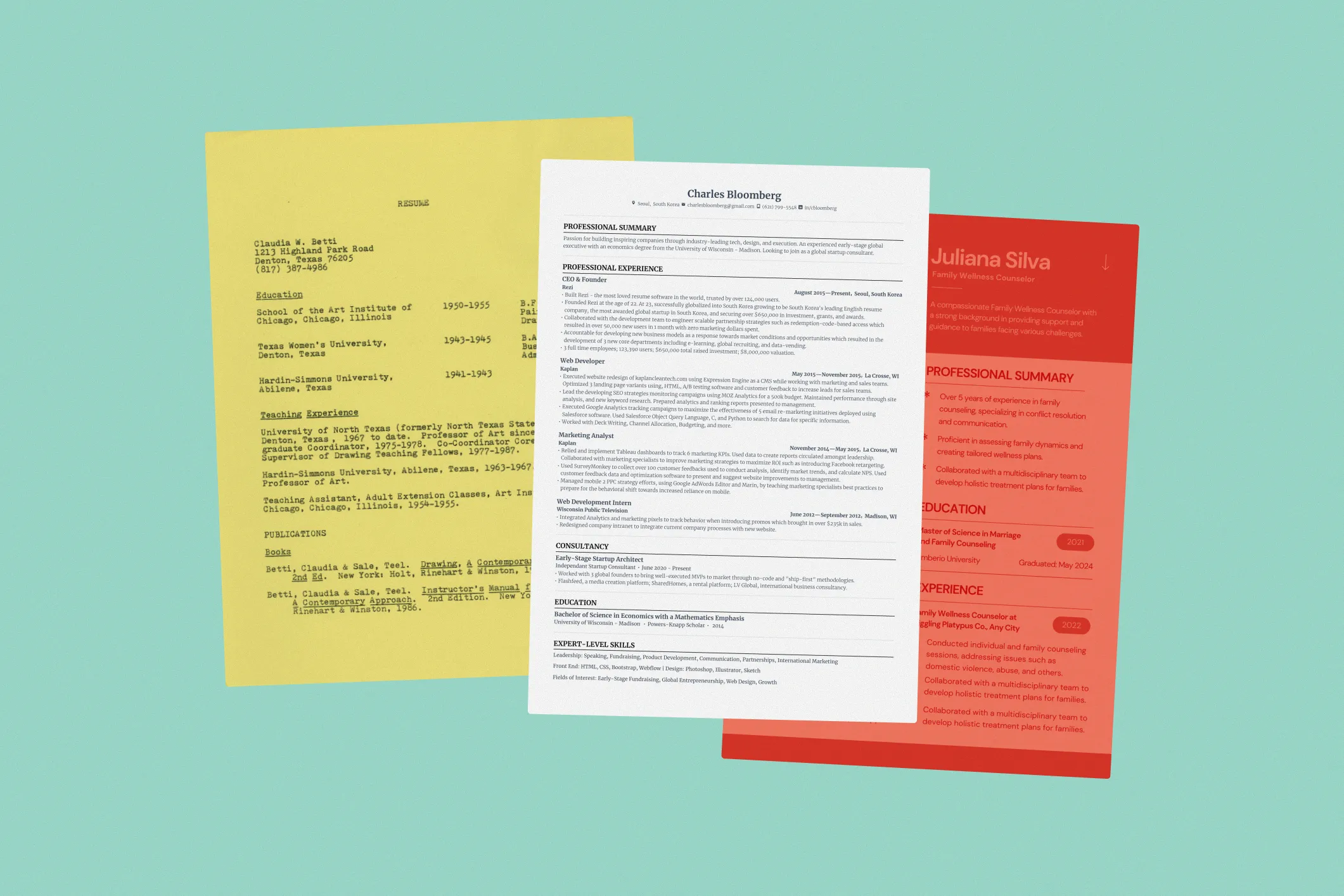
Resumes have gone through clear cycles, from the plain, typewritten pages of the 1940s–1980s, to the structured Word templates of the 1990s–2000s, to the colorful Canva designs of 2015–2023. Today’s trend favors clean, black-and-white, one-column layouts that are easy to read and scan. The focus is on substance: clear headings, strong action verbs, measurable achievements, and tailored summaries that emphasize your skills. Recruiters and ATS value readability over creativity, so fancy fonts, colors, icons, and photos are out. The goal is a professional, concise resume that gets noticed for what really matters: your experience and accomplishments.
Resumes go through trends just like fashion, tech, or social media aesthetics. Y2K clothing is back, digital nostalgia is everywhere — and resumes have had their own cycles too.
I’ve lived through them myself. My first resume was a plain Word doc I copied from my oldest brother. Later, I jumped on the Canva wave with a colorful template that looked great but didn’t land me many interviews.
Now, after a year in the career space with Rezi, I’ve seen what really works. And in 2025, resumes are going back to basics: clean, black-and-white, one column, professional, and easy to read.
I get the temptation to make your resume colorful and creative to stand out. But design doesn’t get you hired (unless you’re applying to be a designer), your experience does. Even without ATS in the picture, think of it like an interview outfit. You wouldn’t wear your loudest, funkiest shirt to meet a hiring manager, so don’t let your resume do that either. Keep it sharp. Keep it professional.
We dive deeper into this in our YouTube video:
And if you’re ready to create a modern, 2025-proof resume, check out our free AI Resume Builder or these guides:
- How to Create an ATS Resume (Templates Included)
- 20+ Common Resume Mistakes to Avoid
- 7 Best AI Resume Builders 2025
- How to Update Your Resume for 2025
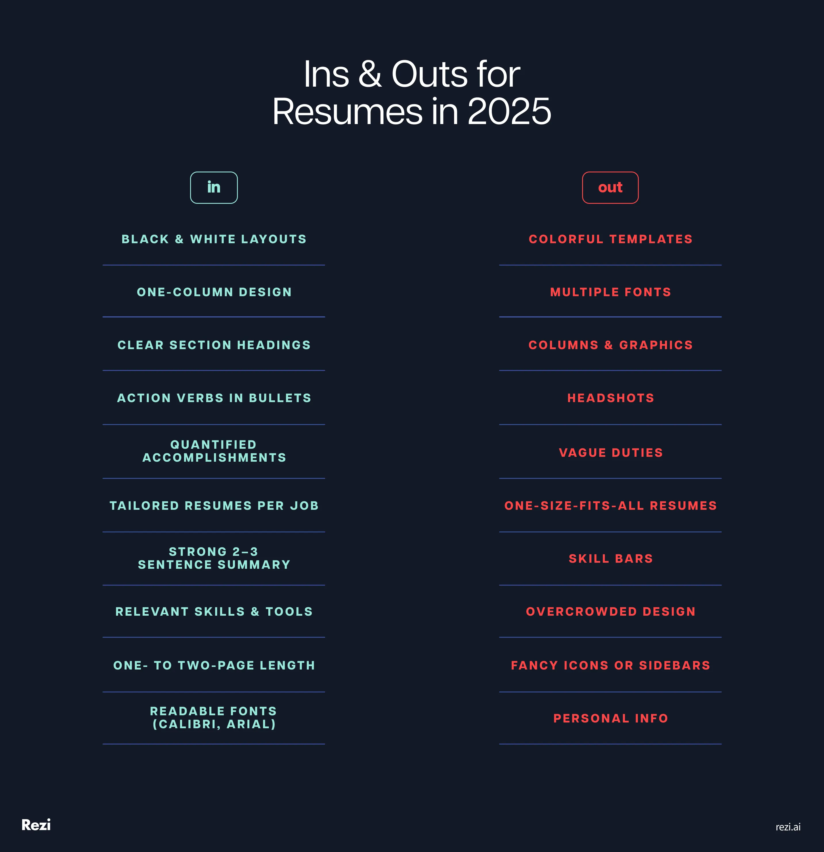
What’s In, What’s Out (Resume Edition)
Here’s what’s in and what’s out for resumes:
- Stick to black-and-white layouts with a clean, one-column format and clear headings.
- Use action verbs in your bullet points and emphasize measurable accomplishments instead of just listing responsibilities.
- Tailor each resume to the specific job and highlight relevant skills and tools. Skip generic, one-size-fits-all resumes.
- Write a customized, 2–3 sentence summary that clearly showcases your achievements and goals.
- Keep your resume concise at one to two pages, use readable fonts like Calibri or Arial, and avoid columns, graphics, icons, or overcrowded layouts.
- Leave out headshots and personal details like age or marital status; the focus should be on your experience and skills.
Want your resume to stand out for the right reasons? Keep in mind what’s in, and what’s out.
History of Resume Design
Here’s the history of resume design:
- 1940s–1980s: Plain, one-page typewritten resumes in black ink; sometimes included personal details like marital status or height.
- 1990s–2000s: Word docs brought bold headings, bullet points, and simple borders that were professional, consistent, and easy to read.
- 2015–2023: Canva templates added color, icons, and sidebars, which were visually striking but not always recruiter or ATS-friendly.
- 2023–Today: Clean, black-and-white, one-column resumes are back, optimized for readability and ATS compatibility.
Did you know the very first resume dates back to 1482? It was written by Leonardo da Vinci himself, in a letter to the Duke of Milan where he listed his engineering and military invention skills. He even had help from a professional writer. Kind of wild, right? Even back then, people knew the value of presenting their skills clearly.
Let’s fast forward a few centuries and look at how resume design has evolved since da Vinci’s time.
Typewriters & Simplicity (1940s–1980s)
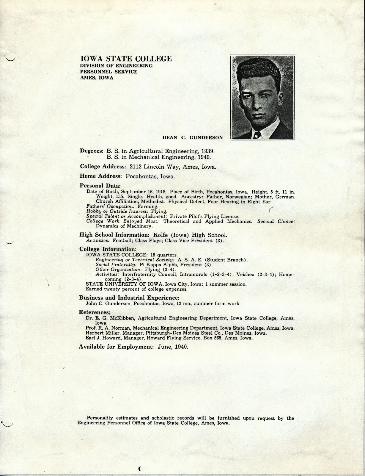
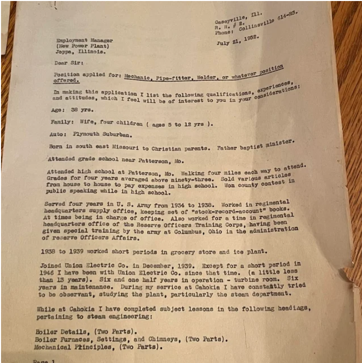
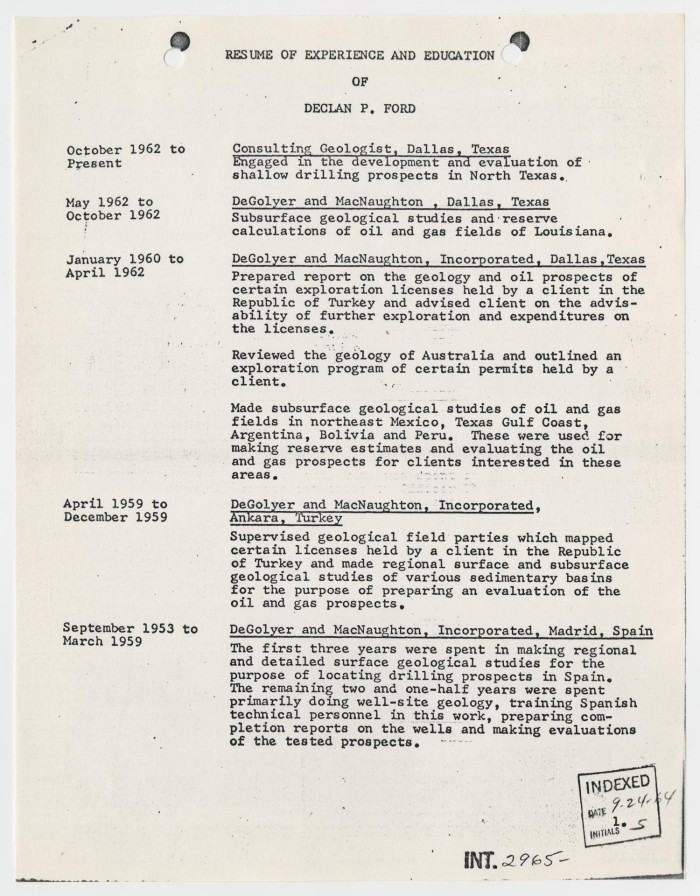
Resumes from this era were as plain as it gets. Typed on a typewriter, one page, black ink, and nothing fancy. They were short, factual, and uniform, leaving little room for creativity.
It wasn’t unusual for resumes to include personal details that would never fly today, things like marital status, social background, and even height and weight (Impact Business Group). Professionalism back then looked very different from what it does now.
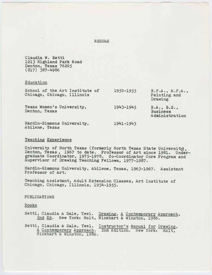
Microsoft Word & Clippy Years (1990s–2000s)

When Word became mainstream, resumes got a little more flexible. There were bolded section headings, bullet points, and maybe even a subtle border if you were feeling daring. Still no colors, still no icons.
For many of us, this was our first “real” resume — professional, functional, and widely accepted. They had a consistency that employers trusted, and by the 2000s, most hiring managers knew exactly what to expect when a Times New Roman resume landed on their desk.
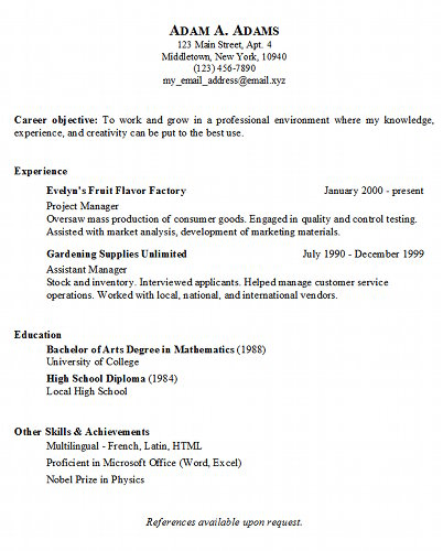
Canva Era (2015–2023)


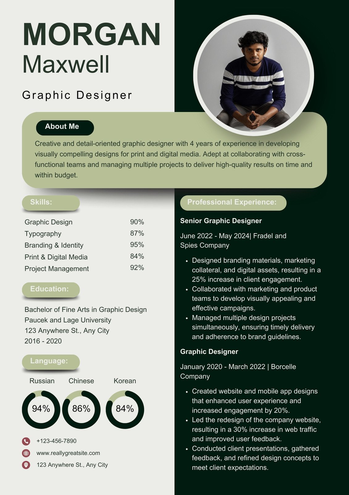
Then came Canva, and resumes suddenly looked like they belonged on Pinterest. This was the age of geometric sidebars, pastel backgrounds, icons, headshots, and multiple fonts. For job seekers, it felt like the bolder your resume looked, the more it would stand out.
And to be fair, these templates were a game-changer for accessibility. Anyone could drag, drop, and build a sleek-looking resume without knowing any design or formatting tricks.
Back to Basics (2023–Present)
-1.png)

Fast-forward to today, and the flashy designs are past their peak. Recruiters have seen enough pastel sidebars and funky fonts to last a lifetime, and job seekers are realizing that clean and simple works best. The 2025 resume is stripped back: black-and-white, one column, no distractions.
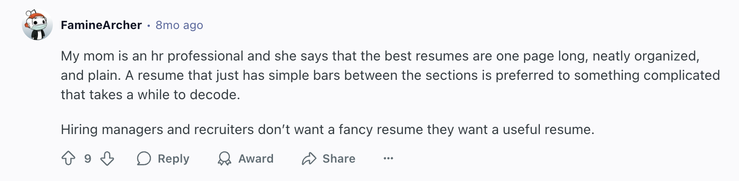
Take it from this Reddit user’s mom:
And it’s not just about looking professional, it’s about making sure your resume actually gets read. 97.8% of Fortune 500 companies use an ATS to scan resumes and filter candidates. We tested nine popular templates (including our own) against a leading ATS, and even the best-designed one only had 58% of its information scanned correctly. That’s why the plain-text, anti-aesthetic resume is making a comeback — because it works.
Read more about our experiment on Why Resume Scanners Don’t Work.
Tips for a Modern 2025 Resume
Design isn’t what gets your resume noticed anymore — visibility is. To make sure ATS scans your resume properly and hiring managers actually see your experience, keep your resume readable, clear, and recruiter-approved.
Here are my top resume tips:
- Go with a single font. Calibri, Arial, or Verdana work best.
- No photos. Headshots can get your resume tossed immediately.
- Write a strong resume summary. In two or three sentences, highlight your key skills and achievements, and mention the role and company. Be specific and show enthusiasm.
- Start bullets with action verbs. Words like “facilitated,” “collaborated,” and “developed” make a stronger impact.
- Bold job titles and companies. This makes it easy for recruiters to scan your experience.
- Use clear headings. Stick with standard labels like “Experience,” “Skills,” and “Education,” and avoid any quirky alternatives.
- Highlight accomplishments, not duties. Use numbers, percentages, or metrics to show the results of your work.
- Tailor each resume. Mirror keywords from the job posting and include relevant tools or industry terms, like Salesforce or Python.
- Keep it concise. One page is ideal; two pages are fine for extensive experience. Three pages are usually unnecessary.
- Keep the design simple. No columns, graphics, or excessive color. Let the content speak for itself.
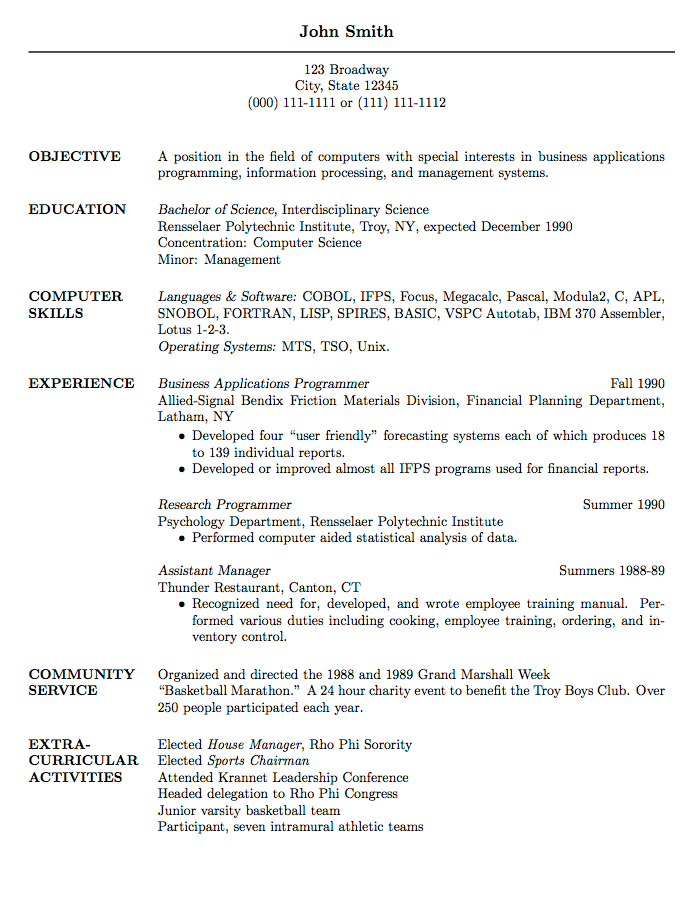
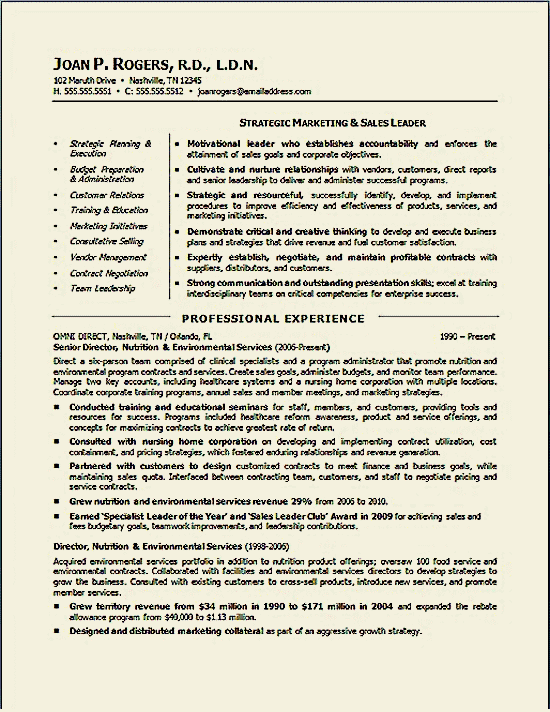
What Does a Good Resume Look Like Now
Here’s what a modern resume typically looks like. One font, black and white, with plenty of space between sections and margins. What catches your eye first? The headings and job titles? That’s exactly the point.
Final Thoughts
The 2025 resume trend isn’t just about looking clean; it’s about making sure your experience actually gets read. Flashy icons and layouts might look nice, but if ATS can’t scan your content, it won’t matter.
A modern resume is professional, clear, and shows off your skills, accomplishments, and impact. Trends come and go, but a readable, recruiter-friendly, tailored resume will always get noticed.
Well, for now. Until the next trend hits — when hiring managers have to open a special app, you appear in hologram form, and recite a riddle about your work history. Until then, let’s just focus on ATS.
FAQ
What are the latest trends on resume writing?
It’s all about impact. Focus on short, punchy sentences and bullet points that highlight your achievements, not just tasks. Tailor your wording to each job, use metrics when possible, and sprinkle in industry-specific keywords so your resume passes ATS scans while sounding natural.
How to make a resume look professional?
Keep it clear, active, and easy to follow. Use concise summaries at the top, focus bullet points on achievements, and organize sections logically. Consistent spacing, formatting, and alignment make it polished, while avoiding photos or graphics keeps it professional.
How to make your resume look better?
Focus on growth and impact. Emphasize measurable results, like savings, improvements, or achievements, and use strong action verbs. Show how your role has grown through promotions or added responsibilities. And get someone else to review it to catch anything unclear.
How long should your resume be in 2025?
One page is ideal for early-career professionals, while mid- to senior-level candidates can go to two pages. The focus should be on relevance and measurable impact, and every bullet should count. If the second page only adds a few extra lines, trim it down.
What is the most trending skill in 2025?
AI literacy is the standout skill for 2025. This includes understanding and using AI tools, generative AI, large language models, and prompt engineering. Employers value candidates who can use these technologies to improve workflows, solve problems, or make data-driven decisions.
What is considered outdated on a resume?
Outdated resumes focus on style over substance. Fancy templates, multiple fonts, graphics, or sidebars distract from your experience, and including personal details like age, photos, or marital status is no longer acceptable. Long paragraphs or listing duties instead of accomplishments also make your resume less effective.

Sarah Coghlan
Sarah Coghlan is a writer and editor passionate about making resume and career advice clear and accessible to all. Based in Barcelona, her goal is to help job seekers create standout resumes and navigate the job search process with confidence and ease.

