
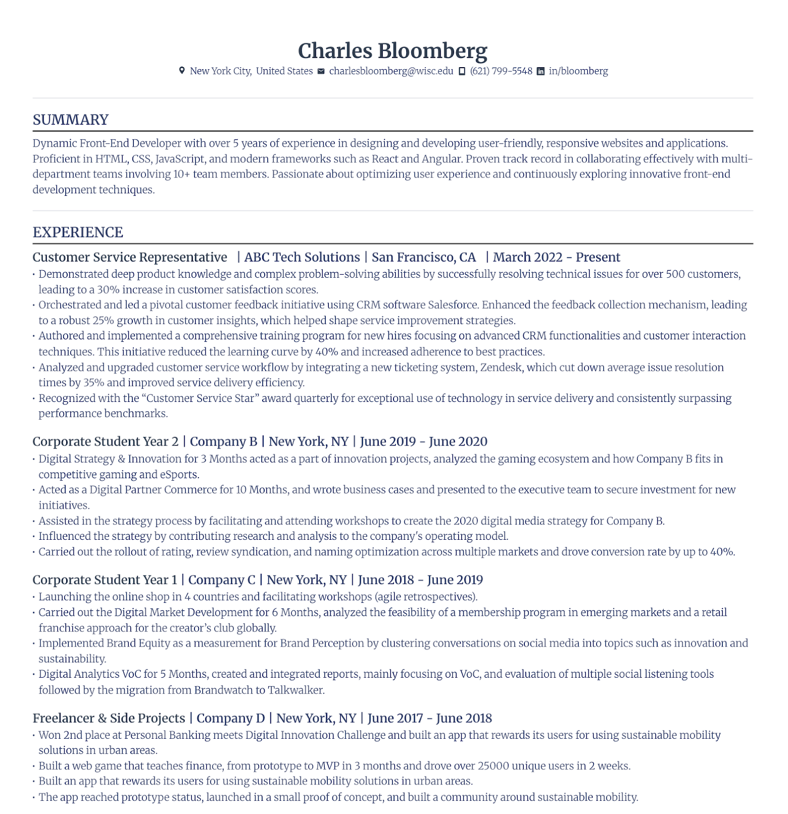
Resume
11 Best Fonts for a Resume: Top Style and Size From 3M+ Resumes
The best resume fonts we suggest are Source Sans Pro, Merriweather, and Calibri. Keep the size between 9–12 points. Helvetica and Arial are good too, and more.

Published on
August 17, 2022
Updated on
August 8, 2025
The best fonts for a resume are Source Sans Pro, Merriweather, and Calibri. There are other excellent choices as well, including Helvetica, Georgia, Garamond, Verdana, Avenir Next, Arial, and more. A safe resume font size is between 10 and 12 points for the main body, and 14–16 points for section titles. However, from our findings of analyzing 3M+ resumes, 9 points is the optimal font size for the main body.
Our go-to font recommendations for job seekers who build a resume using our AI resume builder are Merriweather, Source Sans Pro, and Calibri.
And after analyzing over 3 million resumes built with Rezi’s AI Resume Builder, we found something interesting:
The most popular font size wasn’t 10 or 12 points (like most advice says). It was 9 points.
And for context, Rezi resumes get interview rates above 50%.
There’s a reason for that. Our resume designs are the most ATS-friendly compared to other resume builders.
Before a recruiter reads a single word, they’re already forming a first impression based purely on how your resume looks. A font that’s hard to read, outdated, or poorly sized? It can cost you the interview, no matter how solid your experience is.
Fonts like Arial or Calibri are great if you need to fit more content without compromising readability. Verdana is useful if your resume looks too empty and needs some space filled. Your font should also match your industry. Traditional roles may lean toward Georgia or Garamond, while modern, tech-forward fields are better suited to fonts like Helvetica.
This guide is here to help you get it right.
I’ll walk you through the best fonts to use (and which to avoid), ideal font sizes, how to choose the right one, and what the numbers from over 3 million resumes reveal.
Get your resume done immediately with Rezi AI Resume Builder. It will draft the perfect bullet points, a powerful resume summary, and suggest skills tailored to the job you’re after. And the design and layout? It will always stay perfect. Just pick one of the 15+ resume templates and see your resume write itself.

11 Best Fonts for a Resume
Here are the best fonts for a resume:
- Source Sans Pro
- Merriweather
- Calibri
- Helvetica
- Georgia
- Garamond
- Verdana
- Avenir Next
- Arial
- Lato
- Didot
There’s no denying that your skills and experiences matter most in your resume but it’s not one of the first things the recruiter or ATS scanners notice.
Your font choice and format offer an initial glimpse into your professional personality before anyone reads a word.
Opting for a clean, sans-serif font suggests that you’re modern and forward-thinking, while a classic serif font can hint that you’re more traditional. Both are great options, depending on the job and industry.
I’ve rounded up the best resume fonts and what they say about you. You’ll also find insights into which fonts are best for specific industries and how they align with a company’s culture.
Side Note: these font choices generally work for other professional document formats, such as the academic CV and biodata format.
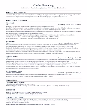
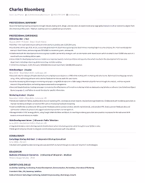
1. Source Sans Pro
Source Sans Pro is a modern, open-source sans-serif font designed specifically for digital interfaces. It’s known for its clean, minimalist design and excellent readability on screens, which makes it a strong contender for any resume that’s likely to be read on a computer or scanned by an ATS.
Here’s how this font looks on a resume:
Pros
- Designed for legibility, Source Sans Pro performs exceptionally well on both screen and print.
- Its balanced spacing and smooth letterforms make your resume easy to skim, which is ideal for fast-paced recruiters.
- It brings a modern, professional look without being overly sterile. Great for standing out professionally.
Cons
- While clean and effective, it might feel too neutral in industries where a bold or creative font is preferred.
- It’s less commonly used than fonts like Calibri, which might feel unfamiliar to some hiring managers.
Best for: Job seekers in tech, startups, or any digital-first field. It’s also perfect for anyone who wants a modern, clean resume design that doesn’t sacrifice readability or professionalism.
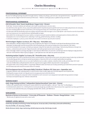
2. Merriweather
Merriweather is an open-source serif font designed to be highly readable on screens, making it an excellent choice for online resumes. This font blends a traditional feel with modern design elements, creating a professional look that’s easy on the eyes.
Here’s how this font looks on a resume:
Pros
- Designed for digital content, Merriweather ensures your resume is clear and legible even at smaller sizes.
- It's semi-condensed style lets you fit more information on the page without sacrificing readability.
- Merriweather’s traditional serif feel is balanced with contemporary shapes, making it suitable for many industries.
Cons
- Merriweather might not stand out as much in creative or visually focused industries.
- The serif design isn’t ideal for fields that favor a more modern, minimalist look.
Best for: Merriweather is perfect for professionals who value a blend of tradition with modernity. It’s particularly suited for online applications for clarity on digital screens.
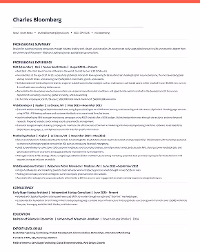
3. Calibri
Calibri is a modern sans-serif font that’s become the go-to for resumes. Microsoft created Calibri to replace the outdated Times New Roman, designed specifically to be clear and readable on screens and in print. Calibri’s clean lines and simple design make it a visually appealing option that keeps your resume looking professional, minus any unnecessary frills.
Here’s how this looks on a resume:

Pros
- Calibri’s clean design and spacing make your resume easy to scan.
- Its contemporary look gives your resume a polished, up-to-date feel.
- As a default font in most word-processing programs, it ensures consistency across different platforms.
Cons
- Calibri is pretty generic and lacks that personal touch — a potential downside in creative fields.
Best for: Ideal for a professional, clean look for most industries like business, administration, and tech. Calibri gives your resume a modern look without distracting from your content.
4. Helvetica
Helvetica is a classic font associated with professionalism and clarity (and “inspirational” quotes written over stock images that were popular in the early 2010s). It gives off a familiar vibe, having appeared on popular platforms like The New York Times and Wes Anderson’s movies. Its clean appearance makes it a smart choice for resumes, conveying a sense of openness and reliability.
Pros
- Helvetica’s simple design ensures that your resume is easy to read at a glance.
- Its classic look helps your resume look professional and polished.
- Available in multiple weights, making it easier to differentiate between sections and headings.
Cons
- Due to its minimalist design, Helvetica might highlight a resume lacking in content.
Best for: Helvetica is great for any industry where a polished, no-nonsense look is key. It’s ideal if you want a clean and familiar appearance, emphasizing clarity and structure.
5. Georgia
Georgia is a classic serif font — a solid alternative to Times New Roman if you’re after a timeless appeal. It’s rather traditional but not obscure, making it a solid choice for resumes that need to convey professionalism with a touch of warmth. LinkedIn even uses Georgia as its default font, which speaks to its credibility and widespread familiarity.
Pros
- Georgia’s serif design gives your resume a confident and polished look.
- Its design is easy to read even in smaller font sizes, perfect for single-page resumes.
- Works well across various industries, blending traditional and modern aesthetics.
Cons
- Its conservative appearance might not resonate with more artistic or non-traditional industries.
- As a serif font, Georgia may be less legible in small sizes on digital screens.
Best for: Georgia is best suited for roles where a professional and formal appearance is key. It’s a great choice to show authority and sophistication while maintaining readability.
6. Garamond
Garamond is a timeless serif font that’s been around since the 16th century. Originally designed by Claude (you guessed it) Garamond, this font has stood the test of time with its elegant appearance. It aligns well with formal resumes because it offers a classic look that feels more refined than the overused Times New Roman.
Pros
- Garamond’s classic style gives your resume a distinguished, sophisticated appearance.
- The slightly slanted, graceful letters enhance readability while adding a subtle touch of flair.
- Its sharp edges and unique strokes help it stand out, especially in headlines or titles.
Cons
- While elegant, its classic look isn’t the best match for more modern or creative industries.
- This old-fashioned style has a theatrical quality, which could be a turnoff for more serious industries.
Best for: Garamond can stand out in fields, such as publishing, academia, or any role with a sense of tradition and sophistication.
7. Verdana
Verdana is a sans-serif font specifically designed for on-screen readability, making it a solid choice for digital and print resumes. The even proportions and wide letter spacing make it easy to read and will help your resume feel less dense. Verdana’s modern style will give your resume a strong, confident impression.
Pros
- Verdana is highly readable digitally and in print, ensuring your resume is accessible in any format.
- Verdana’s clean lines convey confidence and authority without feeling overly formal.
- Available in multiple weights, Verdana allows for attractive and subtle formatting, like bold or italicized sections.
Cons
- The slightly wider characters can make it harder to squeeze in more content on a single page.
- Verdana’s wide-spaced design might appear less professional for formal job applications.
Best for: Verdana is ideal for tech, business, or administrative roles, where clear fonts help smooth over any complex jargon.
8. Avenir Next
Avenir Next is a modern sans-serif font designed to help boost screen readability, making it a smart choice for a digital resume. Unlike its Avenir counterpart, Avenir Next has a more generous spacing, giving it an updated look that feels professional and approachable.
Pros
- Avenir Next’s sleek design gives your resume a polished, up-to-date feel.
- Designed for digital display, it’s easy to read on both screens and in print.
- Avenir Next has multiple weights, so you can easily differentiate between various resume sections.
Cons
- The “book” and “light” weights, as well as condensed versions, can be harder to read, especially in smaller sizes.
- Avenir Next’s contemporary look might not be the best fit for more traditional industries,
Best for: Avenir Next is perfect for creatives, tech professionals, and those in design-oriented fields who want a sleek and highly readable resume that stands out while remaining professional.
9. Arial
Arial is another classic resume choice because of its versatility and wide availability. We’ve all dabbled in this font, so it’s a solid option if you want to play it safe. Arial can make your resume easily readable and familiar, whether viewed on paper or on a screen.
Pros
- Arial is easy to read, making it ideal for resumes that will pass through Applicant Tracking Systems (ATS).
- Works well in various sizes and styles, perfect for different sections of your resume, from headings to body text.
- Its simplicity ensures that your content stands out without being overshadowed by the font.
Cons
- Arial’s overuse can make it feel unoriginal or non-innovative.
- Its neutral appearance might not be the best fit if you want your resume to have a distinctive or creative flair.
Best for: Arial is ideal for job seekers who prioritize clarity and functionality. It’s a safe choice if you’re looking for a font that doesn’t distract from your content.
10. Lato
Lato is a relatively new sans-serif font originally designed for corporate use, making it a good choice for all professional resumes. Its fresh, streamlined look offers a subtle and engaging style that feels formal yet friendly.
Pros
- Lato’s blend of professionalism and warmth makes your resume approachable and authoritative.
- With various weights, from light to bold, Lato allows you to create clear distinctions between different sections of your resume.
- Its sleek lines and contemporary feel give your resume an updated, polished appearance.
Cons
- While unique, its relative lack of ubiquity might make it less familiar to some recruiters.
- In very formal industries, Lato’s friendly vibe might not be the best fit.
Best for: Lato is ideal for professionals seeking a balance of professionalism and personality. You can use this font to create a fresh look without sacrificing a serious tone.
11. Didot
Didot is a neoclassical serif font known for its elegant and upscale design, making it an interesting choice for resumes that need a touch of sophistication. While it’s highly artistic and rooted in Parisian history, Didot remains readable enough for professional use, particularly in creative fields.
Pros
- Didot can add a touch of elegance and sophistication to your resume.
- It’s less common than other fonts, so your resume will appear more distinctive.
- Didot’s artistic roots make it ideal for creative and design-oriented industries.
Cons
- Didot can be harder to read in smaller sizes.
- The font is less suitable for more traditional or corporate roles.
Best for: Didot works best for creative professionals in industries like fashion, photography, or design, looking to convey style and elegance.
What Are the Worst Fonts for Your Resume?
These are the worst fonts for your resume:
- Comic Sans
- Brush Script
- Impact
- Courier
- Times New Roman
Do you want to grab the recruiter’s attention?
A flashy, outlandish font will make you stand out but not quite in the way you want. The key is subtlety. You can showcase your traditional or modern style without letting it overshadow your content.
Here are some fonts that you should steer clear of to keep your resume professional.
Comic Sans
I probably don’t even need to say this, but Comic Sans should stay far away from your resume. It’s fun for things like a kid’s birthday invite but for a professional setting? Absolutely not.
To give you an idea of what it means to use the Comic Sans font on a resume, here’s a real Reddit thread where someone asked, “What’s the best font for a resume?”
One of the top responses?
“Comic Sans MS.”
And what followed was a wall of interesting replies…

You get the idea. Comic Sans on a resume and in a professional setting is a joke, literally.
Its casual, playful feel is the last thing you want when trying to show you’re serious about a job. Stick to fonts that show off your skills, not ones that make recruiters wonder if you’re joking.
Brush Script
Brush Script is another throwback that belongs in the past. Designed in 1942 to mimic brush-written handwriting, it’s way too informal for a resume. It’s also been overused to the point of looking cheap and outdated. Your resume is your chance to show off your professionalism, not to experiment with fonts better suited for a middle school project.
Impact
Looking to make an impact? Ironically, Impact isn’t the way to do it. This bold, sans-serif font is more at home in social media memes or bold headlines than in a resume. Its thick letters make the text hard to read, and using it will only crowd your page. Remember, your font should enhance your content, not overpower it.
Courier
Courier has a vintage charm, mimicking the look of a typewriter, but it’s not practical for your resume. Created in 1955, this monospaced font (where every letter takes up the same amount of space) eats up precious real estate on your page. While it might work for a poetic Instagram quote, it’s not the right choice when you need to present your experience clearly and concisely.
Times New Roman
Surprised to see the classic Times New Roman here? It’s a font most of us know well, but it’s time to let go of this old-school favorite.
It’s not that this font is terrible to use, but unfortunately, age discrimination is a thing, and using this outdated font could imply that you’re behind the times. Plus, the small lines (serifs) at the ends of each letter can make it slightly harder to read.
Overall, it just lacks that fresh feel of other more modern fonts. However, it can be more tolerable to use when applying for more senior or leadership positions.
What Is the Best Resume Font Size? Top Font Size From 3,119,476 Resumes

We analyzed over 3.1 million resumes created using Rezi AI Resume Builder to see what font sizes real job seekers are actually using, and the results might surprise you.
Most resume writing advice recommends a font size between 10–12 points, but our data tells a bit of a different story.
Here’s what came out on top:
- 9 pt – 2,476,957 resumes (79.4%).
- 8.5 pt – 171,160 resumes (5.49%).
- 9.5 pt – 162,938 resumes (5.22%).
- 10 pt – 64,593 resumes (2.07%).
- 8 pt – 48,363 resumes (1.55%).
- 14 pt – 46,959 resumes (mostly used for headings)
- 11 pt – 34,933 resumes (1.12%).
- 10.5 pt – 33,727 resumes (1.08%).
- 12 pt – 23,816 resumes (0.76%).
The most popular font size by far was 9 points. Not 10, 11, or 12.
Why?
Well, it fits more content on the page without sacrificing readability, especially when paired with ATS-friendly fonts like Calibri, Merriweather, or Source Sans Pro.
At Rezi, our resume templates are designed to be pixel-perfect for both recruiters and applicant tracking systems. That’s perhaps why we found that a 9-point font size is the most popular option. It keeps your resume clean, compact, and keyword-optimized, while still being easy to read.
That said, font size isn’t one-size-fits-all.
If your chosen font is on the thinner or more condensed side, you might want to size up slightly. If it’s thicker or wider (like Verdana), you can usually size down without losing clarity.
Font size for the main body of a resume
Your resume font size should be between 9 and 12 points. This is a safe range that’s big enough to read easily, but small enough to fit all your key details on one page.
You want to include everything — your experience, education, and skills. If your text is too small, recruiters will have a hard time finding important details quickly. And going over size 12 could make your resume look crowded or suggest you’re padding it out.
But there are some exceptions. If your font naturally takes up more space, you can go down to 9 points, but avoid going any smaller. If your resume is too hard to read, it’s likely to end up in the “no” pile.
Tip: You can also use other formatting tricks to make your resume more readable. Using bold for your job titles, certifications, degrees, and other highlights can make your resume easier to navigate by directing the recruiter’s attention to the most important parts of each section.
Font size for resume section titles
For section titles or headers like your name or different resume sections, bumping the size up to 14–16 points can make these elements stand out without overwhelming the reader. It’s all about finding the right balance — keeping your resume clear and organized without looking cramped or too spread-out.
Learn more about the best ways to present your resume: How to Format a Resume
How to Choose the Best Resume Font?
Short answer: To choose the right font for your resume, align it with your industry and role, considering the company’s culture and values. For traditional fields, use classic serif fonts like Garamond. For creative fields, opt for modern fonts like Helvetica. Keep the font size between 10 and 12 points. Maintain consistency in your font styles to keep your resume neat and organized, and use font pairing tools to match fonts effectively.
Of course, your resume skills and experience are what really counts, but if a recruiter has to squint to read your resume, they might not get that far. The wrong font choice can turn them off before they’ve even started.
Take a look at these top tips to guarantee you get off on the right foot.
Tailor your font to your industry and role
Choosing the right font for your resume is more than just a stylistic choice — it shows your understanding of the field and the position.
Think about the tone of the industry. For more traditional fields like finance, law, or accounting, stick with classic, serif fonts such as Garamond or Georgia to present yourself as professional and reliable.
With creative fields like graphic design or marketing, you have more leeway. Arial or Calibri are safe bets, but you can also consider fonts with some flair, like Helvetica, Dido, or Lato. Just avoid falling into the style over-substance trap (aka. Comic Sans territory) — your content should always be the main focus.
For tech or startup roles, where you typically find a more laid-back and innovative feel, try fonts like Verdana or Avenir Next. These modern fonts are clean and modern, perfect for showing off your progressive attitude.
Learn how to align the rest of your resume to the job: How to Tailor Your Resume to a Job to Any Job Description
Consider the company culture and values
Not sure how formal your font should be? Dive into the company’s culture and values on its website or LinkedIn page. If you’re applying to a firm known for its traditional and formal environment, opt for traditional fonts like Garamond or Merriweather — they fit right in with a more conservative environment.
If the company has a more innovative culture, such as a startup or a design agency, try modern fonts like Helvetica or Lato for a fresh look that can reflect forward-thinking without being overly flashy.
Remember: your font should enhance your resume content, not overshadow it. The font should match the company’s style and values to show you blend in well with their team.
Choose the ideal resume font size
Recruiters often spend less than ten seconds on your resume. If your font is too big, it’ll look like you’re overcompensating and trying to hide gaps (which doesn’t exactly scream honesty). And if your font is too small, it can be challenging for recruiters to read.
The rule of thumb is to use a font size between 10 and 12 points. This range offers readability and lets you fit your content neatly on the page. You want your resume to be easy on the eyes and quick to scan, while still looking professional.
If you need more space or your font is on the larger side, you can get away with adjusting your font to 9 points. The key is to keep your resume clean and approachable, without giving the recruiter a headache.
Use fonts that are easy to read and professional
Being professional doesn’t mean you have to stick with the old standby of Times New Roman (no, seriously, never use it on your resume). Similarly, making your resume easy to read doesn’t mean using Courier New with its extra-wide spacing. The aim is to strike a balance between these extremes.
In the realm of resume fonts, professionalism is about choosing something that doesn’t distract from your skills and experience. Fonts like Georgia, Calibri, or Helvetica are smart choices because they’re simple, familiar, and easy on the eyes.
These fonts help make your resume look polished and accessible, so recruiters can quickly zero in on the key details. With the right font, your resume will not only look sharp but also effectively communicate your strengths.
Be consistent with your font style
Consistency is key — an old saying to remember when writing your resume. Nothing screams “amateur” like a mix of loud fonts and styles scattered across the page. Sure, it might catch a recruiter’s eye, but not in a good way.
Mixing different fonts that don’t match can make your resume look cluttered and disjointed. Unless you really know your way around typography, stick with the same font for your headings and a separate one for the main body of text. Use styles that complement each other to keep things clean and easy to follow.
Choose between Serif fonts, which have those little “tails” or flourishes, and Sans Serif fonts, which are cleaner and more modern. Sans Serif fonts like Arial or Calibri are often the go-to for resumes because they’re easy to read.
Use the same size for body text and a slightly larger size for headings, but avoid drastic changes. Make sure your margins and line spacing are uniform as well. This way, your resume will look neat and organized, making it easy for recruiters to spot all the key details.
Try font pairing tools
You want your resume headings to stand out with different fonts, but how can you complement the rest of your content? Font pairing tools help you combine different fonts that work well together. The key is finding fonts that share similarities but contrast enough to distinguish your headings.
Pairing fonts that are too similar or completely unrelated can make your resume look messy and disorganized — you want to avoid anything that feels random or out of place. One safe approach is to stick with fonts from the same family, as they’re typically designed to complement each other. You can also match fonts based on size, weight, or spacing.
Tools like Monotype and Fontjoy are great resources for generating font combinations that look good together. They can help you experiment with different pairings to see what best suits the tone and style you want to convey.
Avoid non-traditional or distracting fonts
While it’s tempting to use flashy or unconventional fonts to get noticed, they can quickly become distracting and take the focus away from your content. Classic fonts like Arial, Calibri, or Helvetica are popular for a reason — they’re easy to read and give a polished look.
Avoid anything too ornate or playful, like Comic Sans or decorative scripts, as they can make your resume appear less serious and harder to read. Definitely don’t use a custom-made font that might not display properly across different devices and word processors. Focus on choosing a font that complements your message without overshadowing it.
That said, you don’t have to stick to a plain black-and-white resume. Adding a touch of background color at the top or around the edges is fine — just make sure you spotlight your content with a white background and a clear font.
Does Your Resume Font Matter?
Yes, your resume font matters — though content will always be king. Your font should complement the main body of your resume, not overshadow it. You need to attract the reader’s attention by making your resume easy to read without overpowering your content with distracting or messy styles.
The right font can also show a hint of your personality and professionalism. For example, using something like Brush Script for a corporate job makes it look like you’re not taking the application seriously — a surefire way to hurt your chances. On the flip side, a clean, modern font shows you’re detail-oriented, forward-thinking, and professional.
You also have to deal with Applicant Tracking Systems (ATS), which employers use to scan resumes for keywords. These systems struggle with quirky fonts, which might turn your resume into a mess of blank boxes or unreadable text. Stick with a simple, standard font that’s easy for both people and software to read.
Summary
Here’s an overview to help you choose the right font to boost your resume’s impact:
- Prioritize readability by making sure your font is easy to read at a glance. You want hiring managers to find the key information in seconds.
- Stick with well-established fonts t like Calibri, Arial, or Helvetica to give the best first impression.
- Tailor your font choice to the industry and position you want. Creative fields often allow for more personality, while corporate jobs typically call for more traditional options.
- Aim for a font size between 10 and 12 points for the body text, and use larger sizes between 14 and 16 for headings to make them stand out.
- Use no more than three font types in your resume to keep it cohesive — one for your name, another for headings, and another for body text.
- Steer clear of overly decorative or complex fonts like Comic Sans or Brush Script, as they can distract from your content and make it hard to read.
- Ensure your font is easy for Applicant Tracking Systems (ATS) to process — avoid intricate styles that these programs might not recognize.
- After selecting your font, review how it looks on different devices. You want your resume to have high readability, whether on a computer, tablet, or printed out.
- Trust your instincts. Go with a font that feels right for you — your resume should reflect your personality and professionalism.
FAQ
What is the best ATS-friendly font?
Simplicity is key for Applicant Tracking Systems (ATS), so classic fonts like Calibri, Arial, and Helvetica are your best bets. These fonts are clean, straightforward, and universally recognized by most ATS software, ensuring your resume is easy to read. While your resume content is crucial, it won’t matter if the ATS can’t decipher it. So, stick to one of these ATS-friendly fonts to boost your chances of making it into the hands of a human recruiter.
Find out more: How to Create an ATS Resume
What are the most professional resume fonts?
For a professional look, stick with classic fonts like Calibri, Arial, or Helvetica, as these fonts are clean and easy to read. Didot and Garamond also work well if you want a touch of elegance. The key is to choose a familiar font that projects professionalism without being too flashy or unconventional.
How big should the font be on a resume?
The ideal font size for your resume is between 10 and 12 points. This range ensures that your text is readable without overwhelming the page. Use 10 to 12 points for body text and 14 to 16 points for headings to create a clear hierarchy and keep your resume organized and accessible.
Is size 10 font too small for a resume?
A size 10 font is acceptable, but it’s on the smaller side. It can work if your font is clean and simple with wider spacing, but be careful. Text that’s too small can strain the reader’s eyes and make your resume harder to scan. Aim for 9 to 11 points if you need to fit more content on the page, but avoid going any smaller.
What’s the ideal font size for my name on a resume?
Your name should stand out, so use a font size between 14 and 16 points. This size is large enough to grab attention without being overwhelming. Keeping the name font slightly bigger than the rest makes it easy for hiring managers to see who you are instantly.
Serif or Sans-Serif font: which is better for my resume?
The choice between serif and sans-serif fonts depends on the impression you want to make. Serif fonts have small lines or “tails” at the ends of letters (like Times New Roman), giving them a classic, formal feel. Sans-serif fonts, like Arial and Calibri, lose the tails, resulting in a cleaner, more modern look.
Sans-serif fonts are typically better for resumes, especially if you’re applying to modern, tech-savvy industries. They’re easier to read on screens and give your resume a sleek, contemporary vibe. However, if you’re aiming for a more traditional or academic field, a serif font could be more appropriate, offering elegance and formality.
You can also combine a serif with a sans-serif font: use one for headings and the other for the main body text.

Lauren Bedford is a seasoned writer with a track record of helping thousands of readers find practical solutions over the past five years. She's tackled a range of topics, always striving to simplify complex jargon. At Rezi, Lauren crafts genuine and actionable content that guides readers in creating standout resumes to land their dream jobs.